Dynamic Communications
Dynamic Communications Week 9
This week we went out into the city to take pictures of objects or buildings that we can later manipulate to spell out the letters of our names, the hardest part of this for me wasnt using photoshop but actually finding what to take pictures of.

With Comps Slip

For the with comps slips i decided to create different ones depending on how much a person has donated to the kickstarter project, the message on the comps slip stays the same with only the names of the rewards that change however the design of the slip will be different depending on how much they donated
Normal Certificate – Sent with: Name on the wall, T-shirt, Custom casings rewards
Alpha Certificate – Sent with: Voice command and Early buddy bot rewards
Beta Certificate – Sent with: Beta buddybot and Book reward
Normal:


Alpha:


Beta:


Typography and Headings
The font i have decided to use throughout my project is called Iceland, it’s digital look works well with the theme of my project and also maintains legibility as different sizes.
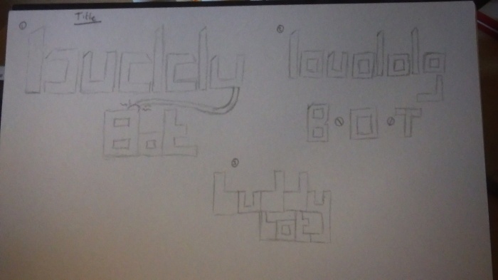
The typography i have experimented with will use this font, the page above has examples of the titles i may use in the banner with my preferences leaning towards the first title.

On this page there are draft versions of the subheadings, with the third draft looking to be the favorite this time. I have digitally recreated these and worked into them further:
Heading

Example of A Sub-Heading

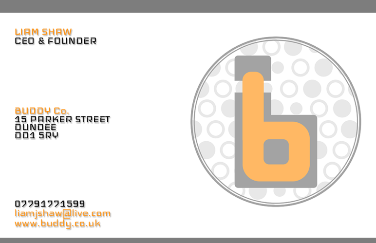
Buisness Card

Front of Card – On the front i have gone for a very clean design, not quite minimalist but the layout helps separate the information well, i have used the same colours as i have on my kickstarter page to maintain continuity.
I have included the most important parts, name, job title, logo, address and contact information.

Back of Card – On the back i have simply placed the logo in the center, there does not need to be information on the back and keeping the amount of images to a minimum will cut down costs of reproducing the business cards.

When planning the card i looked at other companies that deal with technology, apple and microsoft. In doing this i was able to see how a business card should look, information needed and how to achieve the overall feel of a technology based company through the card.
.
Reward and Stretch Images


Dynamic Communications – Week 7
This week it was all about reviewing each others blogs, giving ways we can improve and finding examples for ourselves on how we can improve our blogs. What I’ve taken away from the feedback is that i need to crop my images that i have taken and i also need to post links on which projects i had drawn inspiration from which creating my kickstarter project.
Reward And Stretch Ideas
To help me get an idea of how to space out rewards and what to give a rewards i have looked at other kickstarter projects to do with technology. This helped me a lot in deciding on which approach i will take to this.
Reward Ideas:
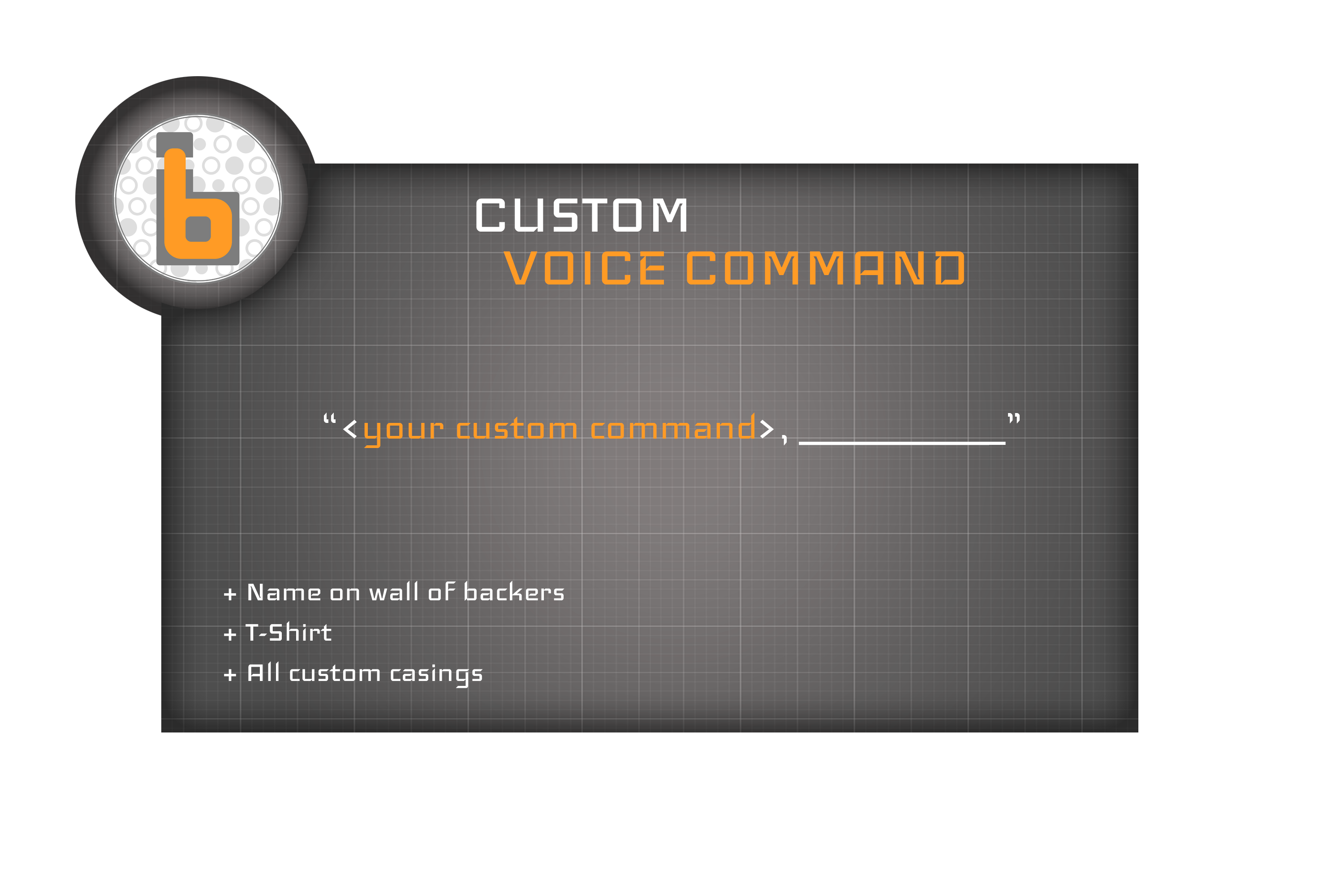
Customised Voice Command – Instead of activating the buddy bot using the command “Buddy Bot” They will have their buddy bot customised to be activated by a different phrase of their choice
Pattern Pack 1 – Receive the Malebot and Fembot shell casings
Pattern Pack 2 – Receive the Malebot, Fembot, Camo, Shock and Sunrise shell casings
T-shirt – A T-shirt with a buddy bot printed on it
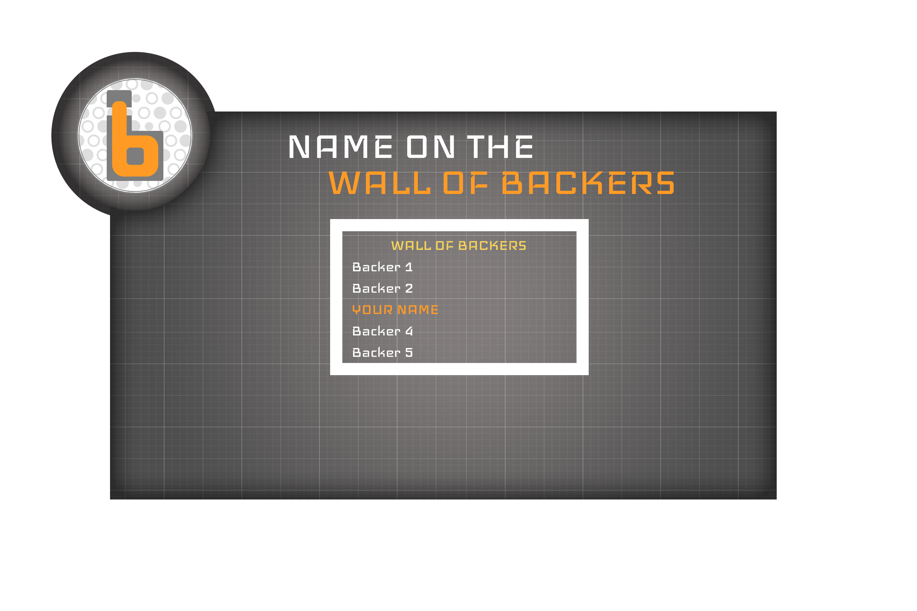
Name on The Wall Of Backers – On the website their name will be put on the backers page
Early Bot (limited amount) – Receive a buddy bot early before official release
Two Bots One Stone (limited amount) – Receive 2 buddy bots early before official release
Beta Model (5) – Recieve a beta model that was used for testing
Book of Creation – Recieve a copy of a book which contains all plans, blueprints and sketches of the creation of the buddybot
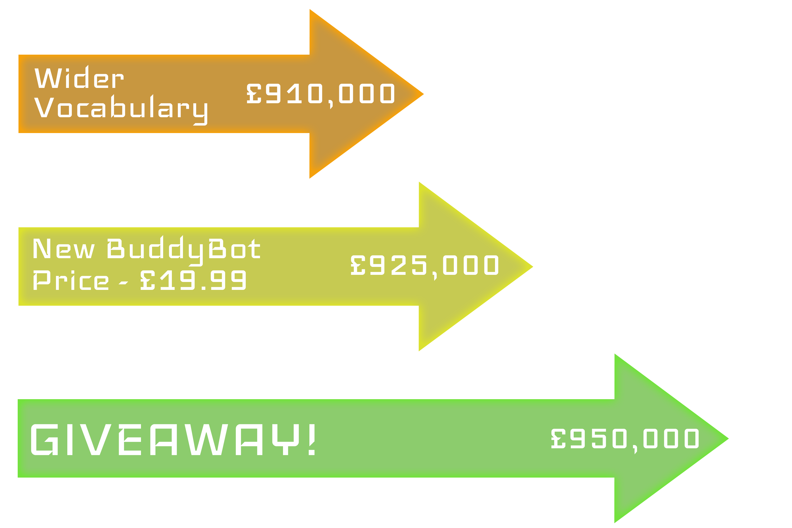
Stretch Ideas:
Wider vocabulary programmed into the buddy bots database
New retail price is £19.99
A Giveaway
I have also made draft versions of how i want these rewards and stretch goals visualised on the page:


Logo 2
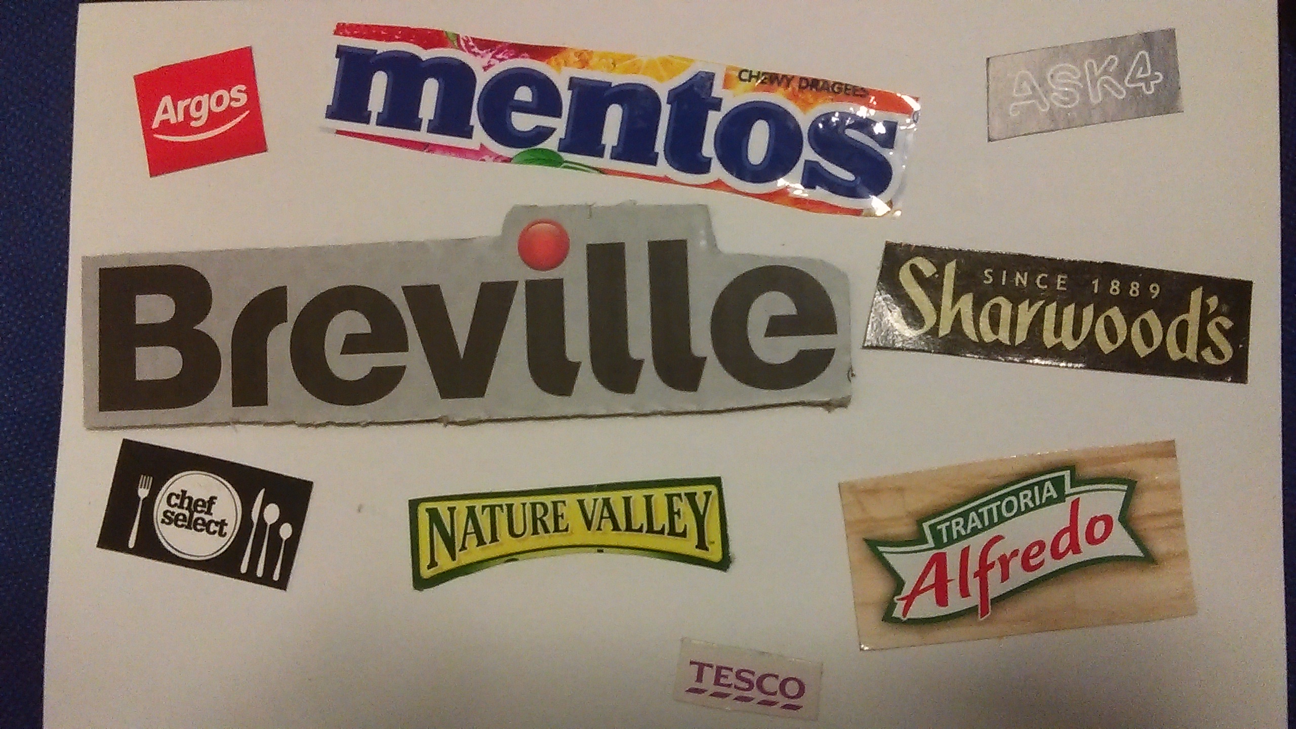
Already existing logos do not have that many colours that they use, its about three at most. My class taught me that this is to cut down costs of reprinting the logo. The ones i have gathered use block colours and only one of them uses shading thought it is only in a small area.
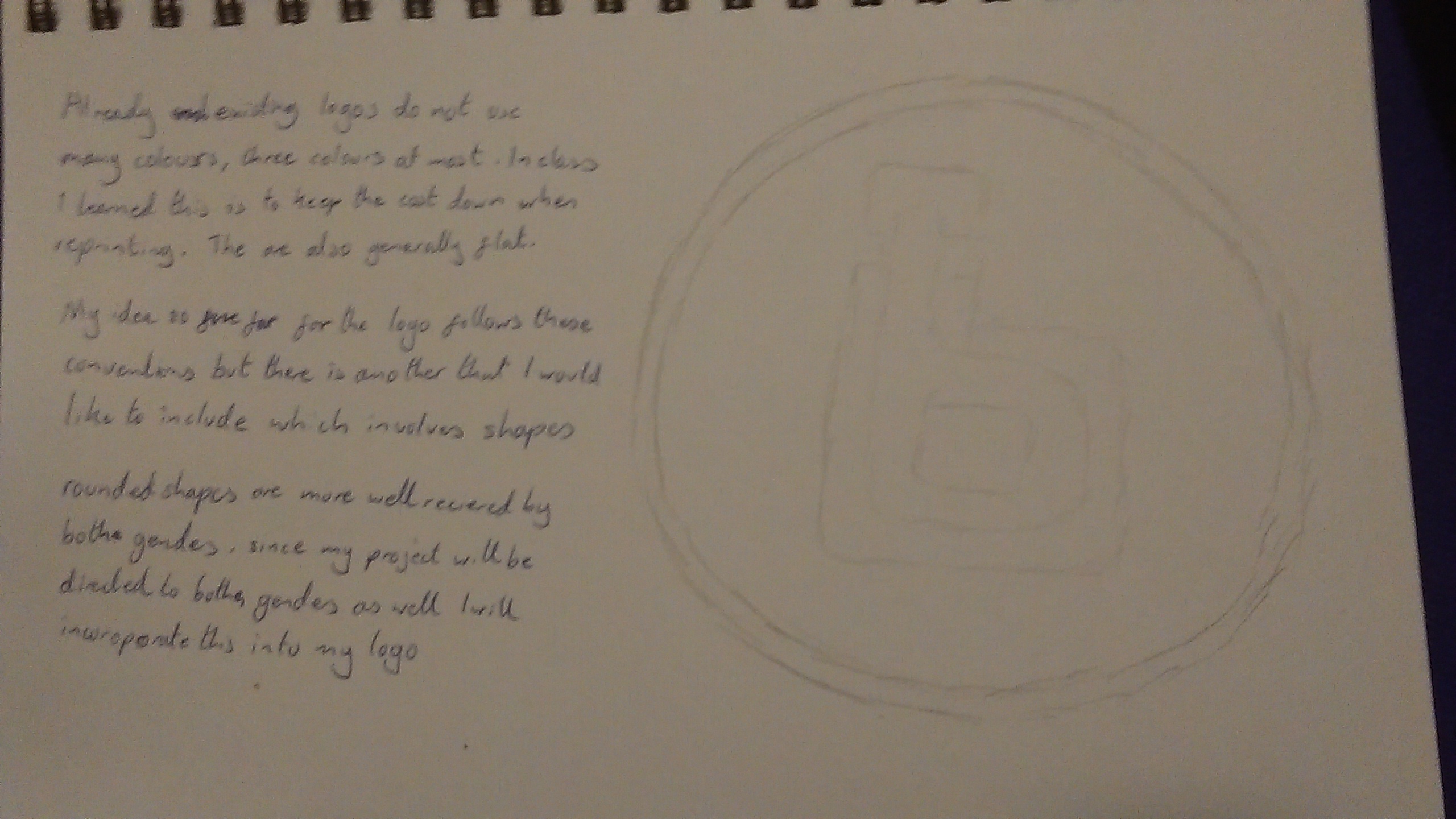
My idea was to follow these conventions, but there is one more thing i would like to add which involves shapes. A circle. Circles are well received by most genders and since my product inst biased towards one then i find this choice to benefit my logo.
This is my final logo, i had experimented with other colours too before deciding to use the orange. I have also used my idea of circles in it and have used only two colours which will keep costs down for reprinting it. It is also not very detailed and can be shrunk down to smaller sizes.


My visual style for the kickstarter is starting to show through, using orange white and grey as the main colours and keeping a relatively technological theme, as i have said earlier orange is a very inviting and warm colour which will make the audience more welcome and the use of circles is also a plus.
Dynamic Communications Week 6
This lecture was honestly a little confusing to me, i have work to catch up on so i will review the lecture notes later and add an edit to this post. We looked at logos again in more depth to their design and meaning, it is important to use continuity in your logos and the shapes of said logo in order to avoid confusion, for example using a green circle in one logo and a yellow triangle in the other will be likely to make the audience think the logos belong to two separate companies.
Speaking of which incongruous and mixed branding can also be confusing due to how many different signals it gives to the audience, if it inst clear enough if the companies are working together or if the branding is advertising the surrounding logos or if it is just there as a standalone logo. I’ll need to know this for if my campaign will have sponsors and will make me consider how i will display their logos in a way what wont be misunderstood.
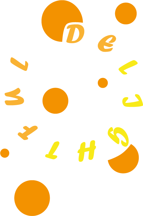
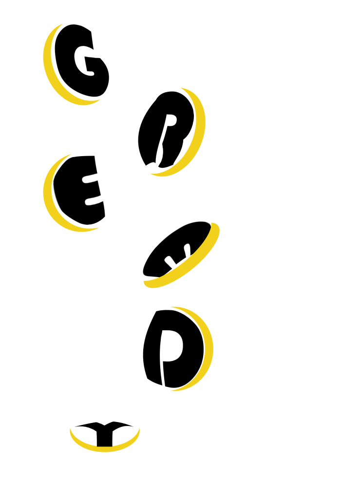
In the next class i got even more familiar with using illustrator, we created typography that filled the page and the nature of the typography was to express the word we had to edit creatively.
This time around it was much more easier to use the software though i did forget to switch to the layout that i saved in the last lesson.